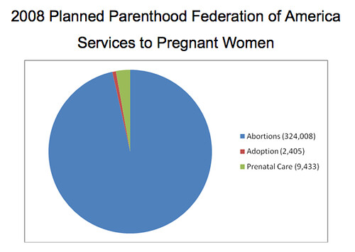
Take your right-wing propaganda book and turn to the section written 514 days ago by Thomas Peters. I want to show you how you can take a bunch of numbers, throw them in a chart maker, and write a blog post that can fool anyone who doesn't understand math.
Now, I know that this is an old post and a third grader could easily refute this but we've got folks passing it around again as though the math is golden so we have to cover the material. In fact, I think you should thank the person who tipped us off about this because it gives us a chance to show yet again how much good Planned Parenthood really does and to what depths some people will sink - lying, cheating, etc. - to reinforce their fantasies. If nothing else, there is a moral tale to be told here.
First, Mr. Peters shows a big bar graph demonstrating that abortion services rose from 1997-2008 at PP while adoption services and prenatal care services declined. He seems to imply that this has happened because PP is an evil monster that lures pregnant women in off the street with promises of candy if they will just have an abortion. That's pretty ridiculous. It's like noting that Big Mac sales rise and Chicken McNugget sales decline; therefore, McDonald's is targeting customers - nay, dragging them in off the street - and forcing them to eat unhealthy hamburgers for fun and profit. There are many other factors that come into play regarding the rise and fall of abortion rates. I challenge you to find some evidence that Planned Parenthood lures, coerces, or forces women to have abortions. You won't find any.
Next, Mr. Peters reveals a pie chart alleging to show PP's overall services to pregnant women. Here it is:
96% abortions, eh? Something's missing. PP does a whole lot more and not just for pregnant women. Here are some 2008 numbers that Mr. Peters conveniently left out of his chart.
Contraception and sterilization for men and women - 3,813,875 (35%)
STD/HIV testing and treatment - 3,721,336 (34%)
Cancer screening/prevention - 1,849,691 (17%)
Pregnancy testing, prenatal care, midlife and infertility issues - 1,132,972 (10%)
Abortion - 324,008 (3%)
Primary care/other - 101,727 (1%)
Which means the pie chart should look more like this chart from PP's own website:
We can be cruel and play the same trick back on Mr. Peters (who is, by the way, Catholic). Let's take pretty much the same numbers and relabel them. Abortion now means "kids molested." Prenatal care is "kids baptized." Adoption is "kids confirmed." Now let's see what the same chart would look like.
At this point Peters would be caterwauling about the misrepresentation of the data as well he should. It would be ludicrous to conclude from this pie chart alone that the Catholic Church overwhelmingly molests kids, the molestation rate is rising, and that molesting occurs in preference to baptism or confirmation. Not only are we comparing apples and oranges here but we're doing so in an incomplete manner that does not fully represent all the data.
Ethical people choose not to intentionally misrepresent data. Remember, class, only people who are wrong need to change the facts. And if the facts don't fit your beliefs, then you are the one who must change. Fudging and playing around with numbers is not acceptable. If Peters hates abortion and contraception, he should just say so and back up his opinion in some other manner. He should not try to convince you through manipulation of data that 3% = 96%.
That is all for today. Class dismissed.


No comments:
Post a Comment